Lessons from a Century of Market Returns
Every year, Dimensional Fund Advisors publishes an interesting visual tool: a matrix of historical market returns across asset classes, geographies, and time periods. By way of example, this is what the page for the S&P 500 looks like:
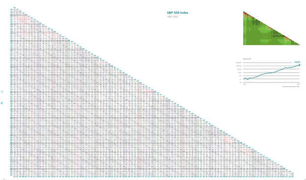
How to Read the Return Matrix
From here, it is hard to see what you are looking at but if you zoom in, this is what a small portion of the matrix looks like:
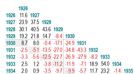
Here’s how it works:
Choose your starting year along the top of a column.
Choose your ending year down the side.
Where the row and column meet, you’ll find the annualized return for that entire period.
In this example, you can see that had you invested at the beginning of 1929 and sold at the end of 1929, you would have lost 8.4%. Similarly, if you invested in 1926, after 9 years (at the end of 1934), your compound annual return would have been 2.0%. The closer you are to the diagonal edge, the shorter the investment period. One year returns are found right at the top of the column under the year.
At the top right of the page, there is a heat map which visually shows from a distance what the performance looks like. The heat map converts the returns to shades of red and green based on positive (green) or negative (red) returns.
Here is a closer view of the heat map associated with the S&P 500 from 1926 to 2023 and a key which tells you the numbers behind each color.

What Nearly 100 Years of Equity Data Shows
One interesting observation to be made is that the S&P 500, or equities more broadly, has experienced long stretches of negative returns. The last 100 years offers several sobering examples.
Between 1929 and 1943, investors experienced fourteen years where cumulative returns stayed negative. Even someone who “bought the dip” in 1930, thinking they were taking advantage of a bargain, would not have seen a positive annualized return until 1943. The late 1960s and 1970s told a similar story. An investor who entered the market in 1968 endured seven years of losses and did not reach a 5% annualized return until 1980.
More recently, the decade from 2000 to 2010 delivered almost no return for the S&P 500. A dollar invested in 2000 did not achieve a 5% annualized return until 2018. The Nasdaq took even longer to climb back from its 2000 peak, remaining below breakeven until late 2014.
At the one-year level, the range of outcomes is very large: calendar year returns have ranged from –43% to 54%.
Once you look past the boxes closest to the diagonal edge, the picture becomes much more consistent. By the time you reach twenty-five years or more, the matrix is almost entirely green. Returns cluster tightly between roughly 9% and 11%, with very few long-term periods falling outside a 5% to 15% range. This narrowing of outcomes is the reason equities are often described as a long-term asset: the further out you go, the less volatile and more stable the results become.
The matrix also captures the essence of equity risk. Equity risk is accepting the possibility of losing 40% or more in a single year in exchange for the possibility of achieving 10% annualized returns over very long periods. This is the tradeoff: volatility in the short run, growth over the long run.[1]
A Contrast: One-Month Treasury Bills
The longer the time horizon, the greener the boxes. But the path to those long-term outcomes is rarely smooth, and the matrix demonstrates that clearly.
Let’s shift gears and look at the One-Month Treasury Bills matrix.
One-Month Treasury Bills (1926-2023)

It looks a lot more comforting. One-Month T-Bills never had a negative year.
There are no red boxes in this matrix. Nearly every year, returns fall between 0% and 3%, with only a brief period in the late 1970s and early 1980s when investors earned even more than 5%.
From this, you can define the “risk” of T-Bills as follows: T-Bills sacrifice the possibility of achieving high returns in exchange for stability.
But that’s only the story pre-inflation. When the matrix adjusts for inflation, the picture becomes more complicated.
What the Data Shows After Inflation
Inflation-Adjusted S&P 500 (1926-2023)

You can see when you adjust the S&P 500 for inflation, there are more and larger pockets of red along the diagonal. However, the bottom (long-term periods) is still all green. Over long periods of time, the market has generally delivered between 6% and 8% after inflation. Ultimately what this inflation-adjusted matrix tells you is that over long horizons, equities can preserve and grow purchasing power.
When you adjust the One-Month Treasury -bill matrix for inflation, it tells a very different story. The red explodes on the chart.
Inflation-Adjusted One-Month Treasury Bills (1926-2023)

Even over very long periods, inflation erodes the purchasing power of cash-like instruments. An investor who put $1 in One Month Treasury Bills in 1932 would be underwater as of 2023.
Managing Investor Psychology
These matrices offer a useful reminder of what markets can deliver and what they cannot. After long stretches of strong performance, many investors become increasingly comfortable taking on more equity risk. Since 2009, investing in equities, especially the S&P 500, has been psychologically easy. From 2009 through November 2025, the S&P 500 produced an annualized return of 14.9%. Only two calendar years were negative. The market fell 4.4% in 2018 and 18.1% in 2022. In both cases, the index recovered its losses by the end of the following year. There were two other periods of meaningful drawdowns, the first quarter of 2020 and April 2025, and both reversed very quickly.
This environment reinforces recency bias, which is the tendency to overweight recent experiences when forming expectations. Many investors forget that equities can deliver extended periods of negative returns or forget what it feels like to live through those periods. Others convince themselves that the rapid recoveries of the past decade are the new normal. I hear many investors say things like, “why should I invest in anything but the S&P 500?” That seems like a reasonable idea if you can extrapolate the experience of the last fifteen years into the future. However, the matrix helps counter this bias. It shows that though the 15-year annualized return since 2009 was 14.0%, this is an anomaly. The last time the market delivered more than 14% annualized over a 15-year period was from 1986 through 2001. The range of returns across 15 year periods since 1926 is 0.6% to 18.9%. Over this 100 year period, the average 15-year annualized return is much closer to 10.6%, which aligns with long-term equity returns over even longer horizons. This perspective is important in late 2025, when many portfolios are overweight United States equities and when investors question why they should own anything else or shift capital toward strategies that have trailed the S&P 500 during this unusually strong period.
The opposite bias appears during severe downturns. In moments like 2008, when markets fell sharply, many investors assumed the decline would continue indefinitely or that any recovery would take decades. They remembered that the 2000 through 2003 bear market took years to reach a bottom. They also remembered that when markets finally recovered in 2006, those gains disappeared again in 2008. For nearly ten years, equities failed to deliver a positive return. These experiences shape investor psychology just as strongly as bull markets do. Many investors sold equities or hesitated to buy during the decline, preferring the perceived safety of cash or Treasuries.
The matrices provide helpful context. Markets are rarely as strong as they appear during good periods, and they are rarely as hopeless as they seem during the worst periods. The matrices anchor expectations in history rather than emotion.
Importance of Diversification
For investors focused on capital preservation, it is important to remember that T-bills are not a complete solution. While they rarely lose money in nominal terms, inflation steadily erodes their real value. Equities can be uncomfortable in the short term, but over long horizons they have historically protected and grown purchasing power.
For investors seeking growth, the key consideration is time horizon. Equity returns come with a wide range of outcomes. They offer the potential for meaningful upside, but they can also deliver large losses over short periods. Investors who may need capital in the near term should incorporate diversification because equities can decline sharply at exactly the wrong moment.
This is where diversifying alternatives become relevant. They can help smooth short term equity volatility while still supporting long term return goals. Certain liquid, diversifying strategies can play an important role in portfolio construction by mitigating market driven drawdowns without sacrificing long term outcomes. These approaches are not substitutes for equities, but they can be valuable complements that improve overall portfolio resilience.
Alternatives can also serve investors who want protection against inflation but are uncomfortable relying exclusively on equities. Many individuals find it easier to stay committed to a plan when their portfolios experience less volatility, yet traditional stocks and bonds provide limited tools to address this need. Thoughtfully selected alternatives can help reduce the periods of meaningful losses that appear near the diagonal of the matrix and make the long term investment journey easier to sustain.
Conclusion
Ultimately, the value of these matrices is that they give investors a clearer sense of the range of outcomes they may experience over different time horizons. It is important to base investment decisions on information rather than on recency bias. The matrices show both the long term return potential of equities and the severity of the volatility that can occur along the way. They also serve as a reminder that thoughtful diversification has a role, even when, and especially when, equities have dominated recent performance. By grounding expectations in history rather than emotion, investors can approach portfolio construction with greater realism and discipline. For families investing across generations, this perspective is essential because it helps ensure that decisions remain aligned with evidence and long term objectives rather than with the most recent market environment.